


Think of it this way, if you have $10 in your pocket and an item costs $10 you can afford to purchase one unit of the item. But if the price is $5 you can afford to buy 2, and if price is $2.50 you can purchase 4, etc.
Further, since there are more middle and lower income people than rich people, the lower the price the greater the number of people who will be able to afford to buy the product and the more people able to afford the product the greater the quantity that will be demanded.
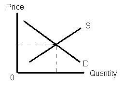
Supply Curve – shows quantities of a good supplied at various prices. The higher the price the greater the quantity supplied.
No business (supplier of a product or service) can afford to sell at a price lower than cost and remain in business. BUT all suppliers of a good do not face the same set of costs. A farmer with fertile soil, a good climate and sufficient rain can produce a larger crop, at a lower cost than a farmer growing the same crop in poor soil in the desert. The desert farmer incurs the same costs for seed, labor, etc. as the other farmer. But the desert farmer must also purchase fertilizer, install irrigation and pay for water. As a result, the desert farmer will have higher costs per bushel of product than the farmer in the ideal location. In order to make a profit on his crop, the desert farmer has to receive a higher price per bushel than the other farmer. The point is that producers of a good or service face different circumstances and some are able to produce at a lower cost (require fewer resources) than others. As the price of a good rises more producers are able to offer the good or service.
As a second example, consider yourself and the sale of your labor services. If you had tickets to a concert for tonight and your supervisor asked for a volunteer to work overtime at the regular hourly rate you probably would not volunteer. If double time was offered, you might be tempted but the desire to see the concert would probably be greater. But, if your supervisor offered a $1,000 bonus to put in an additional four hours this evening, doing your regular work, you would probably take the offer. As the price goes up you, as the seller of your labor services, are more inclined to increase the quantity of labor you are willing to provide. In this example the cost is your opportunity cost. If you earn $10 per hour and your concert ticket cost $50 the decision to volunteer or not is a no brainer since you will lose the $50 spent on the ticket and only gain $40 from working the four hours. If your supervisor offered you double time (i.e., $20 per hour) for the extra four hours you would earn $80 and lose $50 for a net gain of $30. More than likely the desire to see the concert would be greater than the $30 of additional net income so you would probably still turn down the extra work. But $1,000 or $250 per hour, for four hours of work would probably change the equation as the opportunity cost of giving up the extra pay ($1,000) dwarfs the $50 plus satisfaction of attending the concert.
In summary, the demand curve shows the various quantities of a good that will be demanded (i.e., consumers are willing and able to buy) at various prices, while the supply curve shows the various quantities of a good that will be supplied (offered for sale by producers) at various prices. The point where the two intersect is the point where the quantity demanded equals the quantity supplied and this is the equilibrium or market price.
No comments:
Post a Comment